
Our work · Case study · Website design
A website as established as the firm behind it.
Evans & Wislang Solicitors has advised Newcastle and the Hunter since 1984. We designed and wrote their new website to lead with four decades of trust, bring six practice areas and three offices under one clear structure, and make it simple for a new client to take the first step.
The brief
Forty years of reputation, and a website that needed to carry it.
Evans & Wislang is a multidisciplinary firm: family law, conveyancing, wills and estates, commercial, litigation and criminal law. With the acquisition of Vile & Vile Solicitors in Maitland, the firm had grown to three offices, and the website needed to reflect the firm it is today.
The firm wanted to keep what clients already recognise — its colours, its typeface and its own team photography — while making its history since 1984 the centrepiece. The site also had to move from Wix to Squarespace without losing the visitors and search value attached to the old addresses, including the acquired Vile & Vile domain.
- Make 1984 and the firm’s longevity the first thing a visitor understands
- Present six practice areas clearly, without one crowding out the rest
- Tell the Maitland growth story with confidence
- Give every visitor an obvious, low-pressure way to enquire
- Migrate platforms cleanly, with redirects in place
The walkthrough
How the homepage takes a visitor from first glance to first enquiry.
01
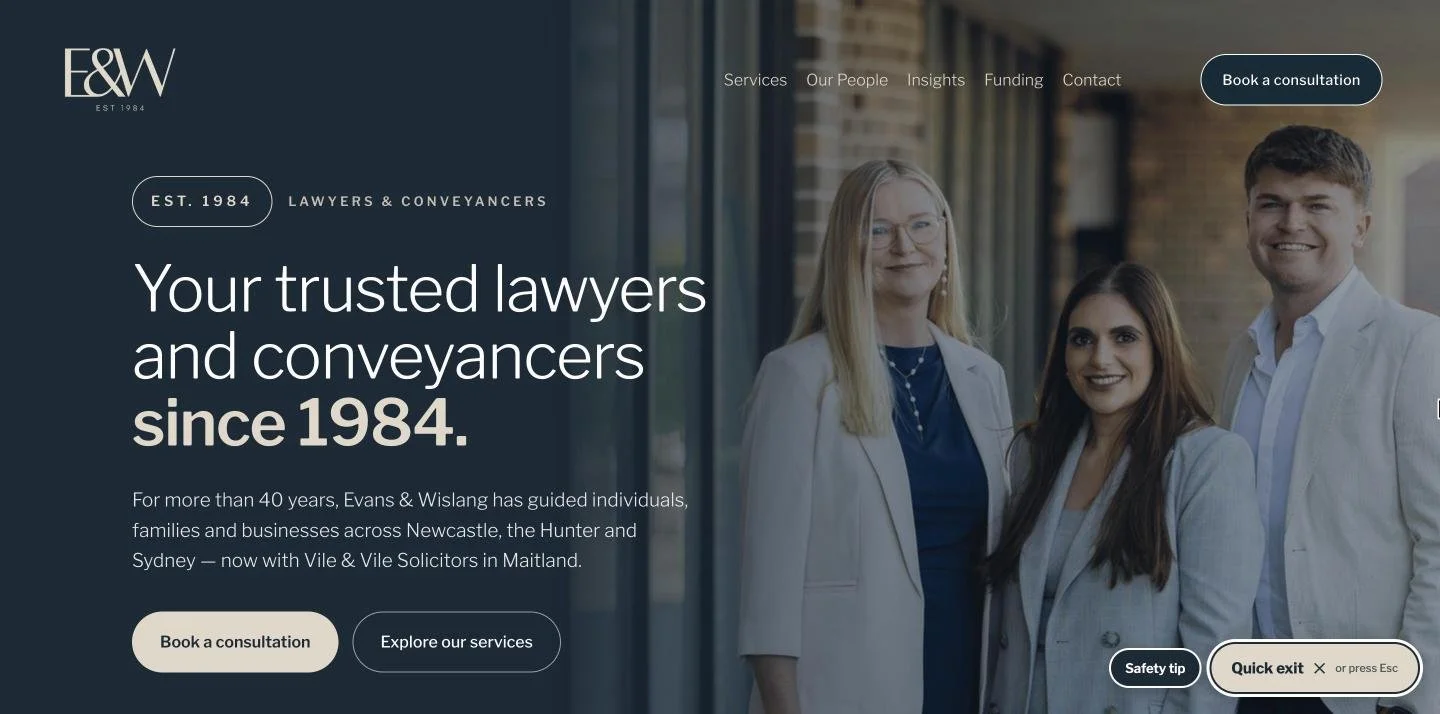
A first impression built on trust
The opening line does the work: “Your trusted lawyers and conveyancers since 1984.” Behind it, the firm’s directors, photographed in their own office. Two clear actions sit underneath — book a consultation, or explore services — so visitors who are ready and visitors who are still looking both have somewhere to go.
- “Est. 1984” carried into the logo lock-up and hero badge
- A Quick exit button and safety tip, for visitors seeking help with family violence matters
02
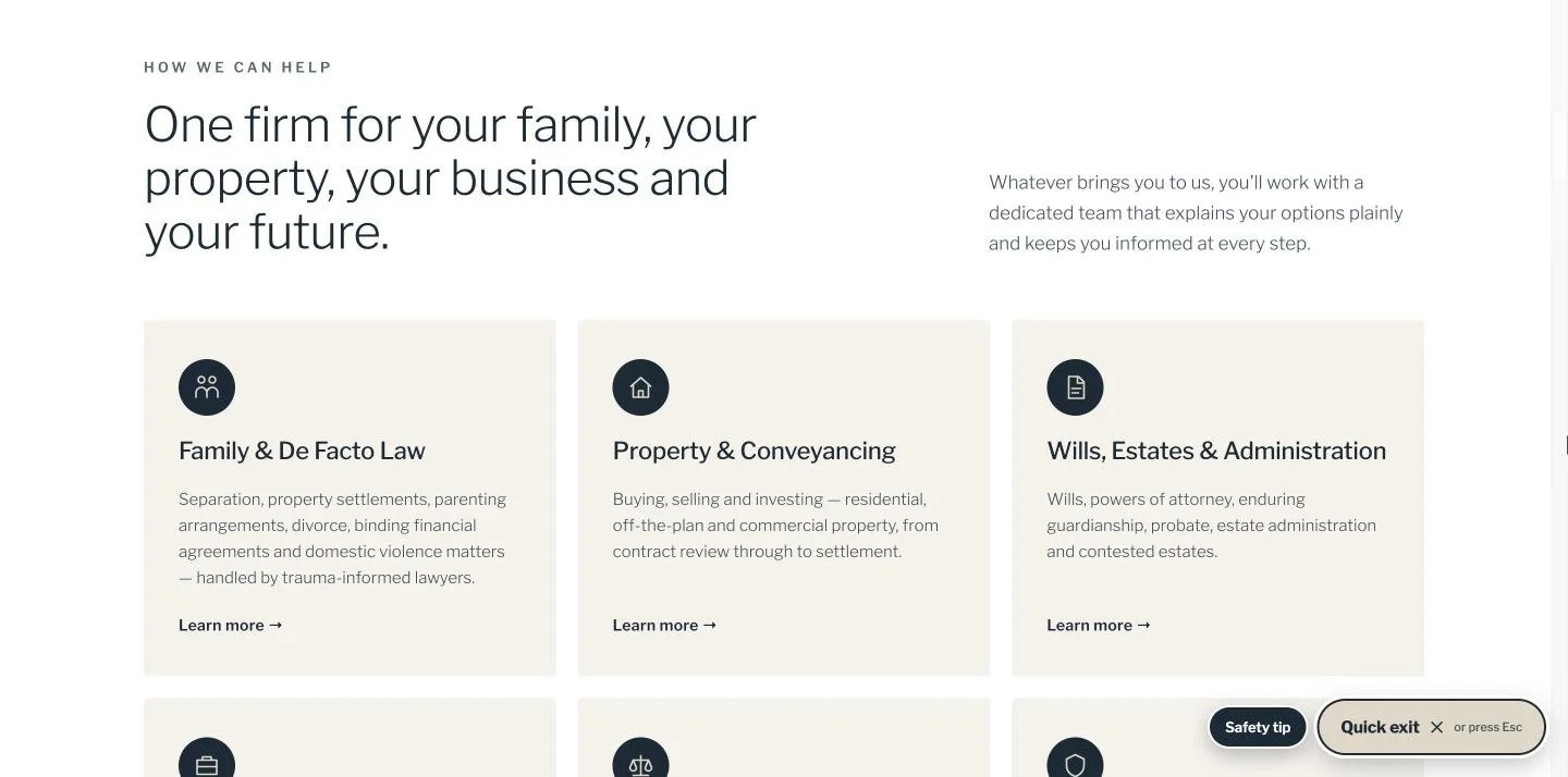
Six practice areas, one clear structure
“One firm for your family, your property, your business and your future.” Each practice area has an equal-weight card with its own icon, a plain-English summary of the matters it covers, and a direct path to its service page. A visitor can find their issue in seconds, whichever area of law brought them there.
03
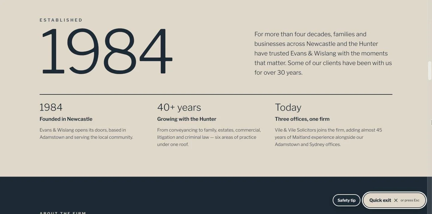
Heritage, used as proof
Rather than telling visitors the firm is experienced, the design shows them. An oversized “1984” anchors a short timeline — founded in Newcastle, growing with the Hunter, three offices today — alongside the detail that some clients have been with the firm for over 30 years.
04
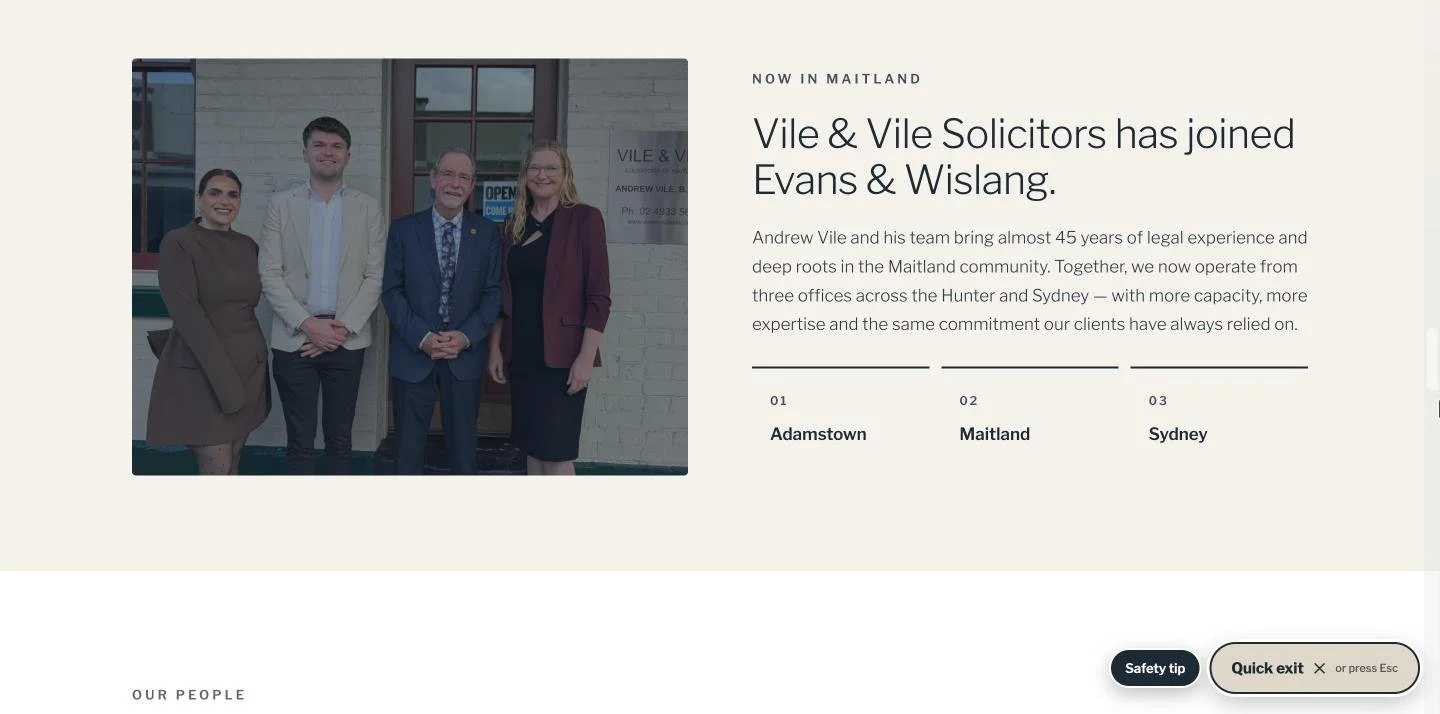
A growth story, told plainly
The Vile & Vile acquisition gets its own section, with a photograph of both teams outside the Maitland office and the three locations set out simply: Adamstown, Maitland, Sydney. Visitors arriving through the old Vile & Vile domain are redirected to the new site, where the joined firm is introduced clearly.
05
Real people, not stock photography
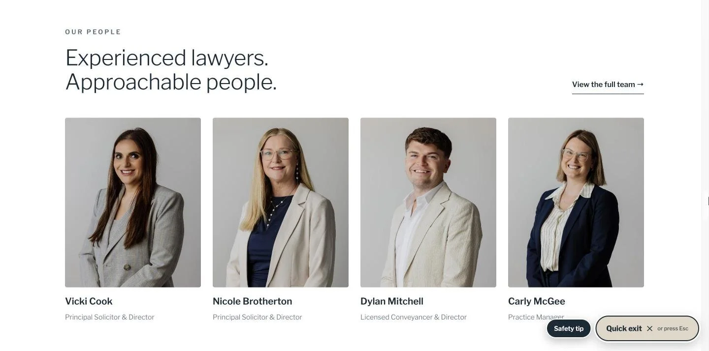
“Experienced lawyers. Approachable people.” The firm’s existing portraits are presented consistently, with names and roles, so a visitor can see who they will be speaking to before they call. In a high-trust profession, that familiarity lowers the barrier to making contact.
06
Removing the reasons not to call
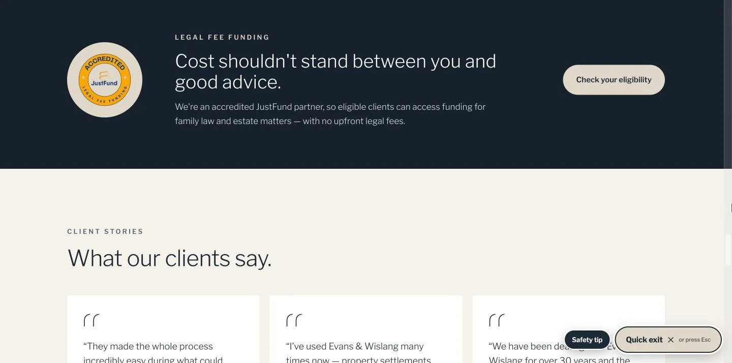
Cost is often the quiet reason people delay legal advice. The firm’s accredited JustFund partnership sits in its own section, with a direct eligibility check. Client stories and recent articles follow, and the page closes with a simple enquiry prompt and the office phone number.
- Funding information surfaced on the homepage, not buried
- Insights section ready to publish articles drawn from the firm’s social content
Behind the build
New website. Familiar firm.
Brand, kept intact
The firm’s navy and stone palette and Libre Franklin typeface carry through every page, so the website matches the firm’s brochures, letterhead and social media.
#1D2A35
#DFD7CA
#FFFFFF
Words that explain
Practice area copy written in plain English, by someone with a background in law, so each page is accurate about the process and still easy for a worried first-time client to follow.
A clean migration
The move from Wix to Squarespace included 301 redirects, including from the acquired Vile & Vile domain, so existing links, bookmarks and search listings continue to land in the right place.
What was delivered
Part of a bigger picture
One standard, from the feed to the website.
We also manage Evans & Wislang’s Instagram and LinkedIn, film reels with their team and produce their print collateral. Because the same team designs the website, a visitor who finds the firm on social media lands on a site that looks, sounds and feels like the content that brought them there.
See the full Evans & Wislang case study →Websites for professional businesses
Is your website as credible as your practice?
For law firms, accounting practices, pharmacies and other high-trust businesses. Clear structure, plain-English copy and a design that reflects the standard of your work.
Website copywriting
$800
Stronger messaging for an existing website: Home, About, Services and Contact page copy.
Website bundle
$2,500
Design and words together, as we did for Evans & Wislang. For a new website or a full refresh.
Website design
$2,000
A clean, modern, mobile-friendly website of up to five pages, built on your logo, colours and branding.
Prices include GST.